Presentation
Zen Design: Simple Design
Principles and Techniques to Enhance Your Presentations
Author: Garr
Reynolds
Reviewed by Harry
{doc} Babad © 2010,
All right reserved.

Publisher: New Riders Press (December 28, 2009)
Publisher
Web Site:
https://www.peachpit.com/store/product.aspx?isbn=0321668790
Garrs Website: http://www.presentationzen.com/
Product Dimensions: Paperback, 265 Pages including the
Index, size: 9
x 7.4 x 0.6 inch paperback or a Safari books online, as an eBook. Language: English
Cost: List $35, Street $23 [USD]; eBook $25 You can both versions
on the New Riders website for under $42.
ISBN-10:
0321668790
ISBN-13:
978-0321668790
Review
Rating: 
Audience: Anyone who needs to
make visually effective presentations that avoid the PowerPoint Yawn or
death by PowerPoint effects. An understated, but real theme of this book is
digital story telling – Good storytellers always hold their
audiences!
Strengths: Well written and
heavily illustrated with examples of the concepts that underlies a great and
memorable presentation.
Weaknesses: Some of the Zen related
information may put off Anglophile presenters or those steeped in the corporate
Microsoft PowerPoint template way. I also, even with a magnifying glass,
found that the illustrations were smaller than I liked, making internalizing
their design elements, a bit difficult.
- - - - - - - - - - - - - - - - - - - -
- - - - - -- - - - - - - - -
Copyright Notice: Product and company names
and logos in this review may be registered trademarks of their respective
companies.
Sidebar #1: Reviews
were written on my iMac 2.8 GHz Intel Core 2 Duo with 2 GB 667 MHz DDR2 SDRAM
running Mac OS X version 10.6.3 with all current security updates installed.
Techniques were tested, more for fun than necessity, for doing this book
review; and I do own the current versions of MS Office (2008) for the
Macintosh.
Sidebar #2: Disclaimer: When reviewing books I
will often use the authors or publishers product, functions and features
descriptions. Because of this unless Im quoting directly from another
source,
I do not cutter up the review with quotation marks. All other comments are
strictly my own and based on my review. Why need I rewrite the developers narratives, if they
are clearly written?
- - - - - - - - - - - - - - - - - - - -
- - - - - -- - - - - - - - -
 Introduction
I had previously reviewed Gar Reynolds Presentation
Zen: Simple Ideas on
Presentation
Design and Delivery, Published by New Riders Press (Peachpit). I found the book
to be both attractive and at times off-putting. To the individual who has never
been exposed to the concepts inherent in Zen, some of the concepts Gar Reynolds
presented seemed alien. That coupled with a somewhat high FOG index will slow
a newbie accepting and practicing the discipline of Using Zen concepts in creating
focused, persuasive e and audience capturing Presentations Initially uncomfortable.
But go with the flow, it will all come together in a way that everyone who is
willing to look and see, can succeed presenting persuasively. It did for me, to
the point that I wanted to learn more, therefore this review. [http://www.maccompanion.com/macc/archives/December2009/Books/PresentationZen.htm]
Book Description
In his internationally acclaimed, best-selling
book Presentation Zen: Simple Ideas on Presentation Design and Delivery, presentation master Garr
Reynolds gave readers the framework for planning, putting together, and
delivering successful presentations. Now, he takes us further into the design
realm and shows how we can apply time-honored design principles to presentation
layouts.
As
a basis for this book, Garr rightly assumes that many presenters lack the
fundamentals of graphic design. After reading this book, the reader will never
be able to look at another presentation slide (or any visual for that matter)
in the same way again. Their eyes will have become sharp and their minds
critical as to what is and what is not effective visual communication and
graphic design.
Presentation
Zen Design includes loads of before and after examples to set readers on the
path to becoming engaging visual communicators. Throughout Presentation Zen
Design,
Garr shares his lessons on designing effective presentations that contain text,
graphs, color, images, and video.
After
establishing guidelines for each of the various elements of a slide, he
explains how to achieve an overall harmony and balance using the tenets of Zen
simplicity. Not only will you discover how to design your slides for more
professional-looking presentations, youll learn to communicate more clearly
and will accomplish the goal of making a stronger, more lasting connection with
your audience. [http://www.amazon.com/Presentation-Zen-Design-Garr-Reynolds/dp/0321668790/ref=ntt_at_ep_dpi_2]
The Nature of the Beast — How the book is organized
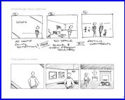 Presentation
Zen Design covers everything from creating a storyboard (pencil and paper
please) through the use of typefaces and color. Key discussions include
well-illustrated section on the use negative space, and slide harmony. Even
more important is Garrs advice to fully rehearse and more importantly to remove
all unnecessary information, especially that which adds to clutter, or undecipherable
techno-junkie slides.
Presentation
Zen Design covers everything from creating a storyboard (pencil and paper
please) through the use of typefaces and color. Key discussions include
well-illustrated section on the use negative space, and slide harmony. Even
more important is Garrs advice to fully rehearse and more importantly to remove
all unnecessary information, especially that which adds to clutter, or undecipherable
techno-junkie slides.
A long-time resident of Japan, Reynolds combines his knowledge of
Zen with his design expertise to give us a beautiful book with a strong point
of view advocating simplicity as a foundation for slide presentations. The book
goes well beyond mere advocacy and is full of specific, unfamiliar to me. These
are techniques and tips that will help us build an attention sustaining
presentation.
The Design Components
In this section the book covers the often ignored importance of Typefaces,
particularly the choice of type and it's placement on the slide. Next Garr
looks at Communicating with Colour. In addition to looking at some
expected terms related to colour and it's use, for example hue, value,
saturation, colour combinations, emotional connections and colour choices, Garr
brings in aspects from the Zen aesthetic through a lesson in Sumi-e.
This is a focused minimalist style of painting that is characteristically Asian, and
has been practiced for well over a thousand years.
In Using Images and Video to Tell Stories we enter the
area that in many ways defines the Presentation Zen style, the use of full
screen images to complement and strengthen the spoken and written message - I
particularly liked this section of the book! Areas covered herein include some
technical aspects of image creation and editing as well as reviewing 10 things
to avoid when using images in your presentations.
Finally in the component section Garr looks at how best to Simplify
Data, how charts can communicate and indeed miscommunicate key
messages, I know from experience that many presentations use charts that are
barely readable, with far too much data, if all presentations followed the
advice given here there would be less sleepy and bored learners and audience
members!
The Principles — So many slides used in
presentations and workshops are full of text, bullet points, charts, and data.
The first part of this section looks at Seeing and Using Space, beginning
with a lesson in the Japanese art of flower design, Ikebana. Garr looks at the
importance of white space, symmetrical/asymmetrical balance, Gestalt theory and
the importance of 'less is more'. The use of focal points in slide design is
illustrated through the Japanese room design feature known as a Tokonoma, in
essence this part of the book, Creating Purpose and Focus, is about
how to ensure the audience's eyes see what you want them to see. The section, Achieving
Harmony looks at the 'rule of thirds' and grids in general when aligning
aspects of your slides and working to connect the various elements to create
balance and harmony.
The Journey — Finally Garr provides pages
of examples of great, if at times too small, Slide Samples that
illustrate the principles outlined throughout the book. It is always good to
see examples, as just as the book reminds us, visual messages trump the written
word. The book concludes with a chapter on Continuous Improvement, a good way
to end, reminding readers that improving your slide design is a journey not a
destination, that through continually learning from the lessons that are all
around you - Billboards, Advertising, TV, brochures, package design - your and
my slide designs will continue to improve.
Great
Slides
Tidbits of Note and another set of great slides
·  What
we should focus on are not the tools and software techniques, but the
principles and elements of visual communication that lead to better design
— whether you use digital tools or not. Without knowledge of basic visual
communication principals, its very easy to let the software templates take you
places where you dont want to go. (Page 9)
What
we should focus on are not the tools and software techniques, but the
principles and elements of visual communication that lead to better design
— whether you use digital tools or not. Without knowledge of basic visual
communication principals, its very easy to let the software templates take you
places where you dont want to go. (Page 9)
· To many
people, the typeface selected may seem like a superfluous thing, but that is
incorrect. The proper choice and usage of type can go a long way toward making
your visual message heard. (Page 33) Robin Williams would agree.
·
Design
for the LAST row. (Page 34)
·
Remember,
people are there to hear you speak — and the visuals can help illustrate
and backup your points — But no one is there to read a load of slide or
to listen to you read them. (Page 35)
·
Before
you decide to display data on screen, you need to be clear on its purpose. Is
it really necessary for the audience to see absolute numerical precision or do
you merely want to show them trends and general relationships? (Page 129)
· The kinds of graphs you
use in a presentation depend on your unique situation and objectives. The only
rule concerning the display of data-besides telling the truth is simplicity.
You can achieve simplicity in the design of effective charts, graphs, and
tables by remembering three fundamental principles: restraint, reduce,
emphasize,
·
Jazz Legend Paul Desmond once said, Writing is like Jazz. It
can be learned but it can't be taught." Much the same could be said of design-about
learning to see and think more visually. Teachers are necessary and important
and they can point the way. But in the end, it's always up to us to learn it, and most of
our learning now is a result of our own efforts and our lifelong commitment
to continuous improvement through education outside the
classroom.
Kudos from Guest Contributors
"In today's economy, all of us—even those of us who
aren't trained as designers—must become design thinkers. But how?
At last, Garr Reynolds has unlocked the secrets and presented them in a
compelling and useful way. Whether you're a professional preparing a talk, a
student tackling an assignment, or anyone trying to craft a richer life, Presentation
Zen Design is the most important book you will read this year."
—Daniel H. Pink, author of A Whole New Mind &
Drive
"To change the world, you need to pitch. To pitch, you need
to design. To design, you need this book." —Guy Kawasaki,
Co-founder, Alltop.com, and former chief evangelist of Apple
"Garr has once again visually captivated readers with a book
that will inspire millions to communicate effectively. He wove together freshly
inspired Zen concepts and displayed them breathtakingly. Read this book, I know
it will take your breath away as it did mine." —Nancy Duarte, CEO,
Duarte Design, and author of the best-selling book slide:ology: The Art and
Science of Creating Great Presentations
Other Contributors include David
Rose about designing when the stakes are high, Maureen C. Stone on he use of
color, John McWade about Picturing your presentation – You are the show
and Scott Kelby on tips for taking better photographs.
"No visual backdrop will energize a lukewarm, uninspired
message. But wrap a clear, powerful, authentic presentation in great design and
you get what every speaker aspires to: electrical connection with your
audience. Buy this book and learn from the best design educator on the planet.
Your audience will thank you."
Disappointments
Too Few Before/After Slides —I agree with
the PowerPoint Ninga [https://www.powerpointninja.com/presentation-books/book-review-presentation-zen-design/]
that compared to Garr Reynolds first book, the way examples were treated in
this more practical design focused book was weaker. In his first book, I
really enjoyed all of the interesting slide examples from various presenters,
especially the before and after examples. I found it really helpful to see a
poorly-designed slide side by side with a well-designed version. In
Presentation Zen Design, I didnt feel as though there were enough before and
after examples, which was a little disappointing.
Image Size — I wish that the publisher, or
Garr Reynolds himself had posted larger images of the illustrations that due to
space limitations were reduced to little more than 4X thumbnails.
Omissions:
Nits and Nats
—
Robin
Williams Design Book Related— I am mystified why the excellent design
books written by Robin Williams (Peachpit Press) were not referenced in either
of Garrs books. Ms. Williams in the The
Non-Designer's Design Book provided my first insight into
design, albeit not of slides, which I often re-check when worrying about the
design elements in my documents.
Conclusion
|
Garr Reynolds is a master of
leading by example. His follow-up to Presentation Zen, Presentation Zen
Design has had a greater impact on me that the first. Why, it focuses,
without being prescriptive, and the things a presentation designer and
presenter needs to do to capture an audience, hold their attention, and leave
them a an unforgettable, at last for a while, message. Garr focuses, using
Zen analogies; essential and critical components of the aesthetics that guide
the development of an effective slide deck. He coverers the design aspects of
slide presentations as well as provide guidance for the presenters,
themselves.
Mr. Reynolds' use of photographic
images is a bold example for those of us who still think photos are an
afterthought. The chapter on the power of the photograph is, even to a
non-photographer, clear and powerful. I especially enjoyed especially the
tips from Scott Kelby, whose Macintosh and OS related books Ive reviewed.
|
Kudos, this is a all would be presenters, and existing serial
presenters should own and use as a reference when creating your own epistle
If you can only have one design book for building your presentation this is it.
(4.0 macCs)
About the Author
 Garr
Reynolds is the author of Presentation Zen and a leading authority on
presentation design and delivery. A sought-after speaker and consultant, his
clients include many in the Fortune 500. A writer, designer, and musician, he
is currently Associate Professor of Management at Kansai Gaidai University in
Japan. Garr is a former corporate trainer for Sumitomo Electric and worked as
the Manager for Worldwide User Group Relations at Apple, Inc. A long-time
student of the Zen arts, he currently lives in Osaka, Japan, where he is
Director of Design Matters Japan. His popular blog can be found at presentationzen.com.
Garr
Reynolds is the author of Presentation Zen and a leading authority on
presentation design and delivery. A sought-after speaker and consultant, his
clients include many in the Fortune 500. A writer, designer, and musician, he
is currently Associate Professor of Management at Kansai Gaidai University in
Japan. Garr is a former corporate trainer for Sumitomo Electric and worked as
the Manager for Worldwide User Group Relations at Apple, Inc. A long-time
student of the Zen arts, he currently lives in Osaka, Japan, where he is
Director of Design Matters Japan. His popular blog can be found at presentationzen.com.
PS:
To look and listen to some fine and impact rich
presentations, check out the TED {ideas worth spreading} site. TED is a small
nonprofit devoted to Ideas Worth Spreading. It started out (in 1984) as a
conference bringing together people from three worlds: Technology,
Entertainment, Design. Since then its scope has become ever broader. [http://www.ted.com/] You might start with Steve
Jobs presentations.